Flight Title Font

In preparation for our film poster and magazine review we have decided to each look at some fonts (primarily using the site dafont.com), pick our favorites and then as a group finally decide on the font we are going to use for the title of Flight.
This is the first font which really appealed to me. I like the way the font looks shaky and edgy which simply sums up our production. The shaky look of the font also represents the surreal element to our film and hints at the underlying narcotic theme present in our film.


I also liked this font and the typography effect used on it. I think this font looks edgy and different. The font also looks broken and cracked which hints at our film narrative, Sophie cracking under the pressure of her ballet practice. One thing about this font which I found to be a negative however is that that font is quite hard to read at a glance due to the broken look of the writing.
I really like the way this font looks handwritten. There is a sense of elegance to this font which represents the first dance sequence part of our film. I think this graceful font could be very effective against the hard-hitting photograph of Sophie we plan on putting on the front of our poster. 

Other 'Flight' logo experiment
Final Font Choice
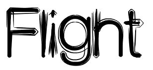
We as a group have decided on this font choice which I found. We feel that out of our choices this one was the most appropriate to use, this is due to the reasons I listed above. We feel that this font would be the most effective against the image of Sophie we plan on putting on the front. I like the elegance of this font and I think that the contrast between the font and image will be interesting for audiences and make them think about the narrative and underlying themes of our production.
Font Analysis

Before deciding on a suitable font for Flight I have decided to do some research into other films and the types of font they use for their production. Hopefully by using doing this research I will be able to gather some inspiration and ideas for our own title font. 

I decided to firstly look at the 'Black Swan' font as we have used the film narrative itself to inspire our final product. I have to say I don't particularly like the font they have chosen to use as I find it very plain and uninspiring, however, I do think the font is suitable for the film is its very prominent and is in a nicely organised and neat format, this mirrors the theme of 'perfection' which runs throughout the production.

 
I really like the way the 'another year' typography is incorporated into the image of a tree. I think this is really effective and eye-catching. The way the tree is going through the motions of all the four seasons gives the impression of year going by, mirroring the 'another year' film name. I think that the font and combined image gives of a romantic/cutesy type of look and hints that the film narrative may include elements of romance. 

The font used for 'Atonement' is very strong and makes a statement on the page, this suggests that the film could cover hard and emotional topics. The smudging effect also adds to the feeling that the film may be quite emotional. The black wording makes the font stand out against the background and the lack of colour again suggests that the film may be quite dark and emotional. The word atonement means 'Reparation for a wrong or injury' and the fact the font is quite harsh hints to the audience that unpleasant events occur during the film. 


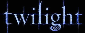
The font gives of a dark fantasy type feeling which I think is perfect for the film 'Twilight' as the film narrative itself revolves around vampires and werewolves. The fact they've used dark colours to mirror the film name 'twilight' is also very effective. I think this font will appeal to the films target audience as it stands out on the film poster and fits in with the fantasy 'twilight' image. 

When I first looked at the 'This Is England' film poster my eyes were immediately drawn to the font, mainly because of the bright colours used, it engages the audience and suggests that the film is fun and interesting. I like the use of colour featured here as many films just chose to stick to one for the font. The red, white and blue colours represent the union jack which is symbolical of Britain and British heritage which tells the audience that the film is going to focus on British themes. The other thing I like about this font is the way it looks tattered, this hints to the audience that the film is going to focus on real issues and real people, the gritty side of British life.

Sight and Sound - Film Review Analysis

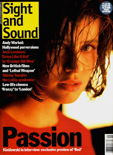
After deciding that our film review would be suited to Sight and Sound magazine I decided to do an analysis on a film review I found in the magazine.
Dragonball Evolution Review - Sight and Sound Magazine, June 2009.

Layout
My initial thought of this page was that the layout is very basic. It is split up into three areas, the review, a short synopsis and half the page is taken up with the credits. Although not my favorite type of layout this is appropriate for the type of reader Sight and Sound target (film critics and academics) as they will be interested in this very text heavy article and the basic layout makes the text easy to read, appealing to the audience. There is a small picture of the main characters at the top of the page which entices audience to read the review, using a picture of the main characters of the film is a good idea as readers may be more inclined to stop at the page if they notice that their favorite actor stars in it. Although the credits take up a lot of space on the page I would not class this as a big design flaw as the majority of people who read Sight and Sound, as stated before, are interested in finding out who is responsible for the different parts of the film. One disadvantage to this review I think is the balance of images and text. The review looks very wordy, although really it has about the same amount of text as the other two magazine review I analysed, I think this is because there is only a small picture at the top of the page. The review could do with another picture to perhaps break up the credits in the bottom right hand side. Although the review looks quite basic I think that it does look professional thanks to the basic colour scheme. Within our magazine review we are going to have to consider whether we want to go for a more fun and interesting look or a basic but professional type style review.

Features
There isn't any features included within this review. I personally find this makes the review very plain and uninteresting as I like to have some engaging features on the page (such as the 'interest curve chat' in Total Film magazine) however Sight and Sound magazine targets an audience who are more interested in reading the bare analysis of films rather than look at unnecessary features. Again within our magazine review we need to think carefully about who we are targeting and add features only if we think the audience are going to be interested.

Film Exhibition

Film
As our film is not a mainstream product, meaning it will only appeal to a niche audience, our film will most likely have a restricted release. This means it will only be shown in approximately 40 - 60 cinemas. The local cinema which is most likely show our film is Cinema 3 in Canterbury. Cinema 3 is located inside the University of Kent, this means that their audience is primarily students (this is also our ideal target audience), film students in particular will be interested in the type of film shown at the cinema this is why Cinema 3 shows a variety of specialist and foreign films but also a few mainstream products. Cinema 3 primarily focuses on showing niche films which are not shown at large multiplexes such as Vue (who focus on showing mainstream film, mostly blockbusters, which will appeal to a wide audience).      For example:

Cinema 3 film listings
Vue film listings
As you can see Cinema 3 shows a variety of film from 'It's a Wonderful Life', a classic American film which audiences will be interested in watching time and time again to 'Les Enfants Du Paradis' which is a french foreign film which will appeal to a niche audience. Vue focus on showing the big blockbuster films, as you can see from the image above all the films shown are blockbusters and appeal to a wide audience. Vue also show films in 3D unlike Cinema 3. As our production 'Flight' is a niche film and will only appeal to a certain type of audience Vue will not be a suitable screening choice.

Poster
As our film is most likely to be shown in Cinema 3 (Canterbury) our film poster would probably be displayed around the surrounding areas. Also our poster could feature in Sight and Sound and similar magazines.

Magazine Review
The type of magazine which would review our film would be a international film magazine such as, Sight and Sound. Popular film magazines such as Empire and Total Film would probably not choose to review our film as they focus on mainstream film which feature famous actors and directors so that their magazine will appeal to a mass audience. Sight and Sound magazine is an international film magazine run by the B.F.I (British Film Institute) and focuses on reviewing all types of film, not just mainstream. Sight and Sound magazine also interviews up-coming directors and promotes new talent.

Twitter

Throughout the course of my A2 project I have been using Twitter to add photos and updates of our progress. I have also 'tweeted' my first drafts and storyboards and gained lots of helpful feedback from my followers on Twitter, they have helped my Media production develop by giving me useful feedback and solutions to problems we have had regarding 'Flight'.


As well as me using Twitter to record our A2 film progression Jack also documented our progress using Tumblr. You can find his blog here.

Wuthering Heights (2011) Trailer


As a fan of Andera Arnold's previous work I was excited when the trailer for her new film, Wurthering Heights, was released.  Right from the start you can tell that this production is definitely the work of Andrea Arnold. Her style of hand-held camera work and diegetic sound is used all the way through this trailer. Arnold also uses binary opposites as displayed in this trailer, for example, we see a mysterious dark scene set within a field apposed with a really light shot of open landscape. I really love this trailer and the way it switches between dark and light scenes. I also like this trailer because of the emotion it captures, all the scenes are very powerful and the shots of the different characters, particularly the ones of their faces, are very emotive. The type of feeling this trailer gives off and the strong emotive feeling we get when watching it is what we hope to achieve within our film.

At the start of the trailer the camera is low, lurking in the long grass. It is apparent that it is quite late at night which adds to the mystery of the sequence. The audience is immediately put on edge and starts to wonder about the happens on the screen, who is this creature? what is it following? where is the location? The scene then cuts to a hand-held tracking shot following a character through the dark location, I particularly like this shot as we only see the silhouette of the character meaning that nothing is given away and the sense of mystery is retained. The hand-held camera work also gives the trailer a sense of realism and makes the audience really part of the action. We then see another dark scene with just enough light to see a young girls face, the girl has a quite a depressed and angry look about her. The dark mysterious scenes along with the emotion displayed by the girl hints to the audience that this film may be quite dark and cover hard topics. The only thing we hear throughout the first part of this trailer is the soft sound of blowing wind, this sound makes the audience focus on the action on screen and draws them into the cinematography. The screen then cuts to a medium shot of plants blowing in the wind, the brightness of this sequence is effective as so far the trailer has been very dark, the scene quickly then cuts to a few sequences of different characters, mostly using long shots, this introduces the audience to all the characters. Shots of nature are included in between these shots of character faces, drawing parallels between the characters and the idyllic countryside setting. We then see parts of different characters faces, this technique is called fragmentation, this continues the sense of mystery which is throughout the trailer. The trailer then uses quick jump cuts of all the characters at key moments within the film, this is typical of a trailer and therefore I will not be using this technique within my production. The only dialogue within the trailer appears three quarters of the way into the trailer, this dialogue finally gives the audience some clues as to what the film diagesis is about. The dialogue is simple, ''you broke my heart, you killed me'' these words give the audience the impression that the film has an underlying theme of love within it but also that the film is quite dark and violent. The dialogue is typical of the drama convention. The diegetic sound of wind and rain runs throughout the whole trailer and ties all the visual cinematography together. The trailer has a strong theme of nature which runs all the way through it. After this voice over we see the film a blurry long shot of a woman walking through another field, this gives off a sense of detachment and the audience starts to ask more questions such as is this the woman who spoke the dialogue? where is she going? drawing the audience into the action. The shot then cuts suddenly to a hand-held shot of a barn and the film name 'Wurthering Heights' appears, the trailer doesn't give much away about the film which leaves the audience with questions and influences them to go and see the production.

Changing Location

We have decided to change our location from Minster (minster toilets and the streets in minster) to Sandwich public toilets and rope walk. This because we didn't receive a reply from Minster Parish Council and so instead of waiting for their reply email and delaying filming we decided to just change the location. Sandwich is also an easier location for us to get to as we can simply walk a few minutes down the road from school, meaning we can film during our free lessons. Photos of our new location are below.

Replacement Street Location
We will be filming on The Rope Walk, this location is perfect as the path is surrounded by trees and a river allowing us to capture some edgy and mysterious shots and allows us to play with shadows as we are filming at night.


Public Toilets
The new public toilets are also a better location to film in as they are a lot easier to get to than the Minster ones. These toilets also have a mirror which the other toilets did not, meaning we can play around with reflections. We can use it to show the two choices Sophie has, should she take the drugs or not?

Experimental Footage (Mobile Phones)

We decided to do some experimental footage with our mobiles to see if we could use this type of filming within our final project. 

The footage below was filmed and edited by myself.

Experimental Footage

The main problems with filming on mobiles is that when the footage is expanded it becomes blurry, this will make the picture look very out of place compared to the rest of the film. The other problem with using mobile footage is that the sound is of a very bad quality or (for example, the video below) isn't recorded at all. If we did use footage like this we would need to add a backing track and re-record any dialogue and ambient sound meaning this would delay production time. For these reasons we have decided to stick with filming all footage with a professional camera.

Experimental Footage (Animation)

To get a feel for our final production and to practice our animation sequences we have done some experimental footage below. The below shots were comprised of a series of photographs taken one after another to give a sense of distortion. From doing this task it is apparent that we need to leave less time between each photo so the footage is a lot smoother, one weakness to the footage below is that I feel it moves too quickly and looks very jumpy.

We all took turns experimenting with animation and taking photos and then I put together the video below to showcase our experiment.

Experimental Footage

Contacting Sandwich Leisure Centre

We also needed to ask permission from the Leisure Centre to be able to film in their room.
Above is the email we sent on the 3rd December 2011.

We received a reply saying that the room was free from 1pm until 2pm every Wednesday afternoon. As we have Wednesday afternoons free this is a perfect 
time for us to film.

Contacting Minster Parish Council


We needed to ask permission from the council to be able to film on their property.
Above is the email Jack sent (on the 1st Dec 2011).
We are currently awaiting a reply.

*Edit*
As we have now changed our location we no longer need to wait for a reply from the council.

Qualitative Research

After looking at the research we previously compiled using Tumblr and also our Audience Interviews we decided that it didn't provide us with the amount of detail we were looking for and didn't answer many of our querires about what people expected from our film. We then thought about why we were not happy with our results and realized it was because we had included a lot of closed questions, usually requiring a yes/no answer (steotypical of quantitative research), this meant that people didn't go into much depth about why they did or didn't agree or like something.

To improve our audience feedback we have decided to do some qualitative research. This requires coming up with a selection of around ten open questions which require detailed quality answers. To get answers we have decided to set up a focus group of around six people, the majority being our target audience, and individually record their answers to our questions.

Questions
1. What issues would you expect to be covered in a social realist based film with the underlying theme of drug use?
2. What characters would you expect to see in a short film of this type, why?
3. What locations do you feel would be appropriate to use in a production of this sort, why?
4. What type of emotion do you expect to feel when watching a production of this sort, why?
5. What type of moral message do you expect the audience to be left with after watching a production focused on narcotics?
6. What editing techniques do you feel would be appropriate in a production of this sort?
7. Do you think that the film should have a realistic or more surreal element to it, why?
8. What kind of sound do you expect to be used to portray meaning to the audience?


Answers
Below are videos of a few members of our focus group giving us their answers.

Developing Skills from AS

As my AS Film was of the period drama genre I didn't get to play around with any special effects or edgy cinematography such as hand-held camera work, our final product was very smooth and polished. Although I really enjoyed creating my film opening last year (can be viewed here) this year I am looking forward to developing my editing skills (as Miranda edited the majority of our film last year) and using special effects to create realism and give our film an edgy twist. I am also interested in how hand-held camera work is going to look and how we can use this to capture our audience and draw them into the action.

Total Film Magazine - Film Review Analysis

My Week With Marilyn Review - Total Film Magazine, January 2012.

Layout
The first thing that caught my eye about this review layout is how professional and simple it looks, the text is well laid out and looks easy to read. The wording in red stands out and directs the audiences eye to key information. The film title is easy to see and also stands out in bold in the center of the page against all the other text. The simple image at the top of the page attracts the audience to the article and breaks up the text, the image is of the main character Marilyn and this lets the audience know that the film is about Marilyn Monroe without them even having to read any of the text.

Features
My favorite thing about this review is the amount of features within it. Like Empire magazine Total Film has a 'verdict' section at the end which audiences can quickly read and also a five star rating but unlike Empire magazine Total Film have other of features such as a 'predicted interest curve' graph, this intrigued me when I first looked at the article and I wanted to find out what it was about, the graph tells audiences when (in their opinion) the most interesting parts of the film are throughout the whole running time. This graph adds something different to the page which isn't just writing. Also on the page is a bubble with a 'talking point' fact in it, this is designed to give the audience some background information on the film which obviously is a 'talking point', I also found this feature to be something different and interesting. The final feature I found on this review is the 'See This If You Liked...' feature, after the heading a number of films in the same genre or which follow the same sort of narrative were listed, the idea of this is that if audience liked a film listed they would probably enjoy the film in the review, this feature influences audiences into watching the film and gives them some idea about what the film is like.

Empire Mazagine - Film Review Analysis

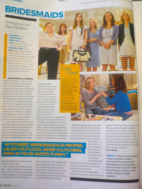
Bridesmaids Review - Empire Magazine, July 2011.
Layout
The first thing I noticed about this review was the colour. I really like the way they have used the contrast colours of blue and yellow to highlight key information, the colour attracts the audience to the review and draws their attention to certain areas of interest which will engage them in the article and make them read on. The second thing I noticed about this review is the layout, the use of rectangles and squares which separate the page, this is very effective and interesting. The boxes break up the block text so at a first glance the viewer isn't overwhelmed with writing. This review has an equal number of pictures and text which I think is the most effective layout as the audience has something to look at as well as information to read, the pictures give hints to the audience about the film and the characters. 

Features
The 'verdict' section at the bottom right hand side of the page is a good feature to have as it allows audiences who don't want to read the whole article to gain some understanding of the film and whether the film is worth going to see or not. Another feature which I also like is the five star rating, the five star rating means that audiences can quickly glance at the stars and understand whether the review is going to be positive or negative. The top of the page has some information about the 'Cast, Director and Certificate', this is informative and audiences are often interested in whether the film has any big stars in it or a famous director. The 'Look Closer' box has some 'fun facts' about the film, director and cast members, this feature gives the audience something different to read and captures their interest.

Black Swan - Film Posters

The Black Swan Film Poster
The Black Swan Film PosterThe Black Swan Film Poster

When browsing the net for posters to analyse I came across these four black swan posters which really caught my eye. I really love these four posters and the artistic feel they all portray. They are all really symbolic and very different to the typical drama film posters, which is what I think makes them stand out. I love the way all the posters have somehow combined both elements of the film together, the dancer and the swan, hinting at the merge that happens between both 'characters' during the film. My favourite poster is probably the top right one because of the simplicity of it, I like how the image of the dancer is inside the swan, suggesting that the swan is controlling them. I also love how the 'black swan' contrasts with the pure white silhouette of the dancer, making the dancer stand out and depicting the 'black swan' as something dangerous. All of the posters use colour very well, simply using red black and white to make certain elements of the poster stand out.

Tumblr Feedback

I also wanted to do some extra research myself so I asked people from the social networking site, Tumblr, their opinions. I used Tumblr to gather feedback from a wider audience as we were only able to collect student opinions at school.

Below are the responses which I received.

Audience Interviews

We wanted to gather some feedback from our target audience about what they expected from our film so we took to the corridors of Sandwich Technology School and found some students within our target audience to interview about their expectations of our short film.

We asked the following questions:
What kind of events do you expect to unfold in a short film which involved narcotics?
Do you expect to see the consequences of the drug taking?
Do you think the film should have a realistic or more surreal element to it?
What kind of character (gender, age) would you expect the main character to be?
What locations do you expect to see within the film?
Would you expect the ending to be ambiguous?


- Miranda Amess, 17


- Edward Stow, 18

Precious - Film Poster Analysis

For my second analysis i decided to pick a film poster which was a lot different from the typical 'main character staring' posters. Although this poster isn't a 'stereotypical' drama genre film poster I feel that it is really interesting and quite hard-hitting. The image is a cartoon silhouette of a large woman who seems to be shattered by a hand, the black of the image stands out against the red background. The film name, 'PRECIOUS', also stands out in white which makes it clear that this is the film name, the name precious creates questions in the audiences mind such as 'what is precious?', 'is this woman precious?', 'why is she precious?'. The image itself is very powerful and quite emotional as the woman is anonymous, making the audience wonder about the character and her story. From the way the image is shattered by a hand it makes the audience think about who has hurt her and what the characters story is, from the placement of the hand we wonder if the woman has been sexually abused. The black and red colouring of the poster also connotes anger, pain, suffering and mystery. On the poster also is all the awards which it has won, this will interest audiences and influence them to watch this award-winning film. The film poster is quite simple but I feel that it doesn't need a lot going on as the main image is powerful enough. Overall this poster is different and unique by the use of the cartoon style drawing and not a photograph of the main character, it certainly stands out against others.

The Social Network - Film Poster Analysis

The social network film poster is relativity simple, but it does draw in audience attention. The film is about the social networking site Facebook and cleverly the poster has the same layout as the Facebook browser. This gives the audience a good indicator about the what the film narrative is about without directly telling them, also this layout may be appealing to audiences, especially those who use Facebook, as they will be familiar with the layout and may be influence to go and watch the film. The main character is glaring at the audience behind the text (this is a typical drama genre poster convention), the character looks like he is staring at a computer, again hinting at the narrative of the film and adds a sense of social realism to the poster. One major issue I have with this poster is that the film name isn't very obvious at all, its at the top right hand side of the poster in small font, sideways, which isn't very clear at all. The tag line 'You Don't Get To 500 Million Friends Without A Few Enemies' is bigger than the film title and takes up most of poster, it does stand out in white especially with the different fonts and writing styles, the fact the tagline is over the top of the characters face suggests that Facebook is a very important factor in his life. The tagline makes the audience wonder even more about the film narrative. Overall I do like this poster and the Facebook browser style background although the film title does need to be bigger and more obvious to audiences as at a first glance it will not be noticed.

Control - Film Poster Analysis

This film poster caught my eye amongst the others. The bright pink font stands out against black and white background making the film title and the awards it has won stand out immediately. The pink font greatly contrasts with the harsh black and white background suggesting that control is not only the film name but also an underlying theme of the production. Including the awards which the film has won I think is very important to include as they catch audiences interest and gets them curious about the film. As well as the colour I feel that the image of the man is also quite striking, he is smoking a cigarette with a glazed expression, we get the impression that this man is quite rebellious. The character also has a sense of mystery and detachment about him, he is facing away from the camera like he has something to hide, this is very unstereotypical of a drama genre poster as the ones I have previously found depict the main character facing straight forwards. The use of a split black and white background focuses the audiences attention entirely on the character, it also suggests that he may have two sides to him as on one side of the character is pure white and the other harsh black. From the simplicity of the poster you cannot guess much about the diegesis the of film, this can be both a positive and a negative thing, it could make the audience curious about the film in question and influence them to watch it but equally it could put many people off even watching the film.

Film Poster Preparation

As well as a short film we also have to create a poster and a magazine review.
In preparation for the film poster I scoured the internet to find posters for films within the 'drama' genre.
I found that a reoccurring theme in these posters was to have the main characters staring intensely at the audience. I do feel that this is captivating and these posters definitely caught my eye when searching through thousands of film poster images. In the next few posts I will be selecting some individual posters and doing in depth anaylsis.

Moodboard

This is the moodboard which I have created for our production, Flight. As you can see from the images I have specifically chosen, they both represent Sophie's split lifestyle - whether she should follow her desire to become a professional ballet dancer or whether she should proceed to life a hedonist lifestyle which involves drink and drugs. We will try and portray this in our short film through what is shown visually.

Drama Genre Conventions

I have researched the conventions of the drama genre to get a feeling for the genre itself and to understand what typical features are generally in drama films, this is so I can either stick to the conventions or oppose them in my own production.


Traumatic realistic events occur throughout the film. 
I think that Flight does cover realistic and traumatic issues. We follow the character Sophie and see her struggle to keep the balance of her passion for ballet and her social life. Many people may be able to relate to Sophie and the events which occur throughout the film.
* Narrative often contains elements that may upset and disturb. 
Our narrative will contain the issue of drug use, isolation/emptiness and the characters struggle to find her identity which audiences may find upsetting and be affected by.
* Portray realistic characters. 
Sophie is an average teenager which many teenagers will be able to relate to.
* Main character is often well developed. 
Our character Sophie will be very developed and the audience will get to follow her and see her develop even more throughout our production.
* Character is often in conflict with either themselves, others, or forces of nature. 
Our film will follow Sophie Evergreen and the conflict she has with herself, the audience will get to see her struggle with balancing her 'two lives'.
* Realistic settings. 
We plan on using realistic settings throughout Flight. All the settings are every-day places which many people will often visit.
* Mise-en-scene relates very carefully to main character. 
All the props and locations we are using relates to Sophie and her life. For example, within Sophie's room we plan on having lots of ballet objects relating to her passion for Ballet.
* Costume is often kept simplistic yet personalized. 
Sophie's costume will be simple, she will be wearing simple ballet clothes for the first half (this also is personalized as it represents Sophie's love for ballet) and average teenagers clothes for the second half.
* Lighting tends to go from extremities. 
We have stuck to this convention as our film will suddenly switch to the bright natural bedroom scene to the outside street scene.
* Close-up shots are often used. 
During our film we will have lots of close-ups of Sophie to draw the audience in and get them to connect with her. Close-ups will also help us to show Sophie's emotions.
* Simple editing techniques used only. No special-effects. 
We are going to oppose this convention as throughout our film we plan on having jump cuts and stop motion. We wanted to give our film an edge and make it stand out from the rest, this is our reasoning for using quite complex editing techniques.
* Clear dialogue between characters used throughout. 
We will not have any dialogue within our film. 

Hand-Drawn Storyboard


Above is a hand-drawn version of our storyboard.
Drawn by Leanne.

Black Swan - Inspiration

Black Swan (2010), Directed By Darren Aronofsky


This scene from Black Swan inspired us when thinking about what shots to use during the beginning dance sequence. I really liked how the camera focuses on the characters face so we can see all her emotions during the performance, we are going to take inspiration from this and have a few close-ups of Sophie while she is dancing to show her determination and passion for dance. The other thing I really liked about this sequence is the way the camera spins round as if we are the character dancing, this is a clever way to draw the audience into the film and adds a sense of realism to the film.

Wasp - Inspiration

Wasp (2003), Directed by Andrea Arnold


We took lots of inspiration from the short film wasp as this film is full of hand-held camera movement and has a phenomenal sense of realism to it. All throughout the film the camera was hand-held, this drew me right into the action and made me follow the story of the character closely. We hope to use hand-held camera work within the second part of our film to make it edgy and more realistic, we want the audience to draw a strong parallel between Sophie and her two different lives. The use of sound within Wasp also adds to the realism, they use diegetic sound all throughout the film, after watching Wasp we are going to consider just using just diegetic sound within the second part of the film again to add to the realism of the film but also to draw the audience in to the action and get them to follow the character and her actions closely.  

Fish Tank - Inspiration

Fish Tank (2009), Directed by Andrea Arnold
After watching the film 'Fish Tank' during our media lessons at school we decided to try and re-create some of the shots which we enjoyed watching. Three of the scenes we hope to take inspiration from are below.


Medium shot of Mia is looking out of her window. I really enjoyed this sequence as we really get to see the characters venerability. The shot is peaceful, with Mia gazing out the window wondering about her life. Before this we see a sun flare and the light streaming through the window onto the characters face. I really liked the peacefulness of this shot and the simplicity. We hope to try and re-create this shot with our character Sophie to show the binary opposite between her 'normal' life and her 'night' life.


Tracking, Hand-Held shot of Mia walking down the road. This is the another scene which stood out to me. The sense of realism within this shot was effective. We felt like we were following Mia on the other side of the road, walking with her. I really liked the hand-held camera work as this made the film more realistic and edgy. We hope to follow Sophie down the street using this hand-held camera technique as we want to draw the audience into the action and symbolize Sophie's current mixed up mental state and venerability.

We will be using fragmentation during the first sequence of our film where Sophie is dancing. Within Fish Tank Arnold uses lots of these shots to depict Mia as a vulnerable young girl who struggles with her identity. These types of shots are interesting and shall add a sense of mystery to our film.

Andrea Arnold - Director

As the director of our film I have decided to do some research into other directors whose work I enjoy. At school we have been watching Fish Tank and also the short film Wasp, both directed by Andrea Arnold. I really enjoyed both films and have been looking into the different film techniques Arnold uses.

Andrea Arnold's films are of the social realism genre.
Social Realist films focus on the raw reality of everyday life.

Techniques
Within Arnold's films she uses lots of hand-held camera work, this helps draw the audience into the action and also gives the film a sense of realism, we will be using this technique within our film to give the sense of distortion and also to add realism. Arnold also uses lots of binary opposites within her films (especially Fish Tank), she uses lots of nature shots which can be compared with Mia and her sink estate life. These binary opposites help the audience to understand the difference between her two 'lives', within our production we will be using opposites between Sophie's 'ballet' life and her 'night' life.
Fish Tank 

Ken Loach - Director

We have learnt a little bit about Ken Loach during our media lessons and I was inspired to do even more when I found out that he focuses on portraying 'British Realism' in his films. Within our production we also hope to add a certain realist element which is why I think it is beneficial for me to research Ken Loach.


Ken Loach was born in 1939 in Warwickshire, Kent. His most famous works include, The Wind That Shakes The Barley, KES, Sweet Sixteen and Bread & Roses.
All his films focus on gritty British life and come under the category of social realism. Some of his most famous work covers the topics of Homelessness and Child Abuse. Ken Loach prefers to use unknown talent who have had some of the life experience of the characters they portray within his films rather than employing Hollywood actors, I feel that by doing this he adds realism to his films as the characters really come alive. Loach is often said to have not given the actors the full script so as they can respond to situations in the narrative naturally. Due to this Loach's work has been described as 'naturalistic' and I feel that his films do give off this feeling due to the realistic atmospheres and characters that feature within them. Within our production we hope to create natural scenes and atmospheres just like Loach has managed to achieve in so many of his films.


Loach once said, referring to the 1948 film Bicycle Thieves"It made me realise that cinema could be about ordinary people and their dilemmas. It wasn't a film about stars, or riches or absurd adventures." Loach set out to create films which were very different to the normal blockbusters which dominate cinema. I admire Ken Loach's directing style and would love to create an edgy film which depicts real life, just like his productions.

My Role

The main roles I will take within our production are:
  • Director
  • Editor
Roles and Responsibilities
I will be in charge of directing the shots and making sure that the scenes are correct, making sure people and props are in the right place and over-seeing the project.
I will also be in charge of editing our product, cutting down the footage and making it fit together, adding in effects and transitions.

Directing and editing will be my main roles, however, I will also be doing some of the sound for our production and I will have to film some of our production due to one of our locations being a girl's toilet which means Jack will be unable to film this section.

Target Audience - Audience Profile

The audience we are aiming to target are the 16 - 24 year olds, this is because we feel they are mature enough to understand the concepts shown within our film and maybe even relate to some of the issues shown. Below is a member of our typical target audience. 

This is Abigail Jones, she is 20 years of age.
She currently lives in Brighton and is in her second year at Brighton university. She studies TV production and cinematography. In her spare time she enjoys reading and watching films, her favorite film genres are romance and drama. Her all time favorite film is The Notebook and her favorite book is Romeo and Juliet. Outside of education Abigail enjoys spending time with her friends, going shopping and to the cinema, she is a big fan of the Twilight saga. Abigail also enjoys going to concerts and her favorite music artists include Ellie Goulding, Ed Sheeran and Katy Perry.