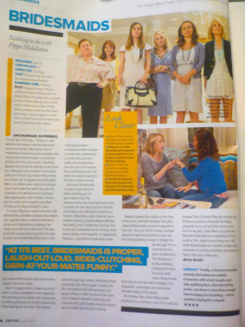
Bridesmaids Review - Empire Magazine, July 2011.
Layout
The first thing I noticed about this review was the colour. I really like the way they have used the contrast colours of blue and yellow to highlight key information, the colour attracts the audience to the review and draws their attention to certain areas of interest which will engage them in the article and make them read on. The second thing I noticed about this review is the layout, the use of rectangles and squares which separate the page, this is very effective and interesting. The boxes break up the block text so at a first glance the viewer isn't overwhelmed with writing. This review has an equal number of pictures and text which I think is the most effective layout as the audience has something to look at as well as information to read, the pictures give hints to the audience about the film and the characters.
Features
The 'verdict' section at the bottom right hand side of the page is a good feature to have as it allows audiences who don't want to read the whole article to gain some understanding of the film and whether the film is worth going to see or not. Another feature which I also like is the five star rating, the five star rating means that audiences can quickly glance at the stars and understand whether the review is going to be positive or negative. The top of the page has some information about the 'Cast, Director and Certificate', this is informative and audiences are often interested in whether the film has any big stars in it or a famous director. The 'Look Closer' box has some 'fun facts' about the film, director and cast members, this feature gives the audience something different to read and captures their interest.
