Before deciding on a suitable font for Flight I have decided to do some research into other films and the types of font they use for their production. Hopefully by using doing this research I will be able to gather some inspiration and ideas for our own title font.

I decided to firstly look at the 'Black Swan' font as we have used the film narrative itself to inspire our final product. I have to say I don't particularly like the font they have chosen to use as I find it very plain and uninspiring, however, I do think the font is suitable for the film is its very prominent and is in a nicely organised and neat format, this mirrors the theme of 'perfection' which runs throughout the production.
I really like the way the 'another year' typography is incorporated into the image of a tree. I think this is really effective and eye-catching. The way the tree is going through the motions of all the four seasons gives the impression of year going by, mirroring the 'another year' film name. I think that the font and combined image gives of a romantic/cutesy type of look and hints that the film narrative may include elements of romance.
The font used for 'Atonement' is very strong and makes a statement on the page, this suggests that the film could cover hard and emotional topics. The smudging effect also adds to the feeling that the film may be quite emotional. The black wording makes the font stand out against the background and the lack of colour again suggests that the film may be quite dark and emotional. The word atonement means 'Reparation for a wrong or injury' and the fact the font is quite harsh hints to the audience that unpleasant events occur during the film.

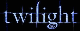
The font gives of a dark fantasy type feeling which I think is perfect for the film 'Twilight' as the film narrative itself revolves around vampires and werewolves. The fact they've used dark colours to mirror the film name 'twilight' is also very effective. I think this font will appeal to the films target audience as it stands out on the film poster and fits in with the fantasy 'twilight' image.
When I first looked at the 'This Is England' film poster my eyes were immediately drawn to the font, mainly because of the bright colours used, it engages the audience and suggests that the film is fun and interesting. I like the use of colour featured here as many films just chose to stick to one for the font. The red, white and blue colours represent the union jack which is symbolical of Britain and British heritage which tells the audience that the film is going to focus on British themes. The other thing I like about this font is the way it looks tattered, this hints to the audience that the film is going to focus on real issues and real people, the gritty side of British life.


