One suggestion made by our media teachers on our second draft was that we used more original sound. (you can see my original sound post here). Our media teachers thought that we could make our film more effective if we created our own sound. We decided to take this feedback on board and work as a group to improve the music on our product to make it more original.
The first thing we decided to change was the music on our dance sequence, we decided to re-create a similar piece of music using the program GarageBand, we worked together to create a piece of music which built up at the end, just like Requiem - Mozart. One thing I found with creating our own film soundtrack was that it was a lot easier to match the sound with the visuals, we had a lot more control which we didn't have when using sound found on Youtube. We created our dance sequence music by using the sound 'Delicate Piano 01' at the beginning and then we used 'Emotional Piano 05' at the end, I am very happy with the music we created as it matches the visuals very well, it builds up well which symbolizes Sophie's struggle and frustration with her dance. As well as using this music over the dance sequence we also played this music at the end of our film to link the two halves of our film together. Another change to our film sound which we made was adding more ambient sound. We decided to increase the amount of ambient sound as this was a key convention of the social realist genre, we added more sound to the rope walk sequence by layering sounds of birds, wind and footsteps on top of the music we used for the sequence. We also recorded and added ambient sound to the beginning of our film so that there wasn't as much of an 'awkward silence' which our media teachers commented on when watching our second draft.
Second Draft and Feedback
Below is the second draft of our production.
Feedback
We sought feedback from our media teachers about our second draft. Our teachers said that they were really happy with the improvements we had made already and our production had moved forward a lot, they did however give us some feedback on how to improve our product even further:
- The use of sound, they said that we needed more sound bridges and to incorporate more sound into our production in general to draw the audience in. They specifically said that we needed sound at the beginning of our production as the long period of silence made them feel awkward.
- Our teachers also said that to further impove our production we should consider using original sound which we could make on GarageBand.
- They also said that we should consider getting rid of the stop motion effect at the end of our product, they said that our end sequence was very powerful and the stop motion effect detracts from the scene.
Final Review Page and Feedback
Below is our final review page.
To see the full sized image please click here.
To see the full sized image please click here.
Feedback
To gather feedback on our review page I uploaded a photo of the ancillary text to Facebook and then asked some of my friends on their thoughts.
As you can see from the comments I obtained the review page received a lot of positive comments with the majority of people saying that our review page looks very professional and fitting the conventions of a typical Sight & Sound review. The one negative received stated that they thought the review was too wordy and lacked colour. I have to say I disagree with this comment, as our review page would be found in the Sight & Sound magazine it wouldn't conform to the magazines conventions if our review included lots of colours/images/features and lacked a good detailed review of our film.
Creation of Review Page
Once I received the synopsis and review (written by Leanne and Jack) I began to put our review page together. I used the program Microsoft Publisher.
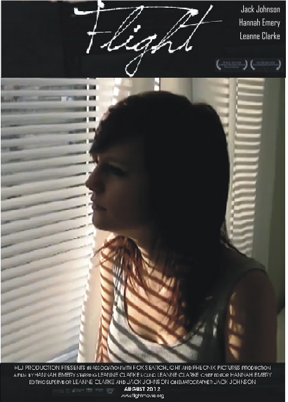
I firstly made my document a suitable size (297 x 210 mm) and imported our chosen flight image. The image we have chosen is similar to the one we used for our poster, the reason we chose a similar photograph is so that both our ancillary texts interlink and can be recognized as a pair. After importing my image I wrote a short caption for the photograph. The caption tells the audience about the photograph and who the character and actress playing her is.
Once I had sorted out my image I created sections ready to import the synopsis, review and credits. I used different tools on Microsoft Publisher to create different coloured lines which I have used to section my review page. I firstly imported the synopsis, I had to ensure that the text fitted inside the right section so I repositioned the text accordingly. The synopsis is at the top of the page, before the main review, to ensure that audiences notice it first. The synopsis lets the audiences know the 'facts' of the text, if audiences don't want to read the entire review they can just quickly read the short synopsis and still find out basic information about the film. Next I imported the main review which Jack and Leanne had written and also repositioned that suitably.
Once the bulk of the review had been imported I then went about adding little touches such as a page heading, quotation and credits and footer which are typical conventions of Sight & Sound magazine. I also changed the colour of some key words to purple (like Sight & Sound have done but with the colour red), this will draw the audiences eye into key words and phrases in the review and will also help to break up the large bulk of text.
As you can see from above I have made sure that our review page stuck to as many conventions of the Sight & Sound review as possible.
Review Page Layout Conventions
For our Flight film review I have been assigned the task of creating the layout for our review page while Jack and Leanne write the article and synopsis. We have already decided that our film would be most suited to the Sight & Sound magazine because our film is of the social realism genre and so will appeal to a niche audience and therefore I am going to follow the layout conventions of reviews in the magazine.
Below I have draw up a guideline of the layout which I will follow to create my review page. As you can see I have stuck to the conventions of typical Sight & Sound articles.
When looking at reviews in Sight & Sound I found that the layouts were all very similar (click here to see my in depth Sight & Sound article review). They generally have just one photograph of the film (used to either introduce a new actor/actress, show a particular star who is featuring in the film, show a climatic point in the film or portray the genre) at either the top of bottom of the page, the film title in a simple bold font and underneath that the basic information about the film and then the review laid out in columns surrounded by the credits. Some reviews also include a synopsis in the bottom right hand corner. The colour scheme used for articles in the Sight & Sound magazine is red, white and black. Sight & Sound reviews are packed full of information and therefore I need to ensure that the layout is suitable to accommodate all of the text, I must ensure that the text is readable and easy to read.
Below I have draw up a guideline of the layout which I will follow to create my review page. As you can see I have stuck to the conventions of typical Sight & Sound articles.
Film Distribution and Funding
What is a distributor?
A distributor is a company responsible for releasing films to the public either via cinema release or home viewing (DVD, Download, Television). A distributor may do this directly (if the distributor owns theatres or distribution networks) or through exhibitors.
Flight
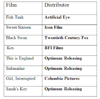
We have decided that the distributor for Flight will be Optimum Releasing, this is because a lot of similar productions have previously been distributed by the company meaning that they would also be a suitable distributor for our social realist production. As a lot of indie productions (Such as, Submarine, This is England, Sarah's Key) have been distributed by Optimum Releasing I feel that the company would also be interested in distributing our specialist film, Flight. Audiences may also be influenced to go and watch the film if they notice that the film is distributed by Optimum Releasing and have enjoys other productions which the company have distributed.
Funding
As Flight is a British product it qualifies for funding by the British Film Institute (BFI). To qualify for the funding films need to take the cultural test. To qualify film makers must obtain a minimum of 16 out of 31 points, they can gain these points by having all British locations, having an all British cast and crew, the film being based on British subject matter or underlying material and the original dialogue being in the English language. By receiving funding from the BFI our production will be able to obtain the financial help and support it needs and will enable me specifically (as director of our product) to create an interesting and entertaining specialist film for audiences and help get my work out there.
'The Film Fund is the production and development heart of the British Film Institute. We support filmmakers in the UK who are emerging or world class and capable of creating distinctive and entertaining work.'
Chosen Poster Feedback
I wanted to find out what the public thought about our Flight poster and if they thought that any changes should be made so I have sought feedback in a variety of ways.
Twitter
As I have been documenting my progress on the social networking site Twitter I thought it would be appropriate to ask my followers what they thought of the final film poster design. Below is the tweet which I posted and the responses I got.

As I have been documenting my progress on the social networking site Twitter I thought it would be appropriate to ask my followers what they thought of the final film poster design. Below is the tweet which I posted and the responses I got.

Public
In order to get a wider range of responses I created a short five question questionnaire to give out to ten members of the public. The five questions I asked and the responses are below.
Question three
Question four
people could choose more than one answer
Question five
people could choose more than one answer
Evaluation
In order to get a wider range of responses I created a short five question questionnaire to give out to ten members of the public. The five questions I asked and the responses are below.
Question one
Question twoQuestion three
Question four
people could choose more than one answer
Question five
people could choose more than one answer
Evaluation
From the responses I received there are a few obvious strengths and weaknesses. The strengths being the poster and the visually appealing colours, I personally like the fact the poster has no other strong colours apart from the background as it makes the poster stand out. Another strength mentioned was the emotive feelings the poster portrayed, the interviewees said that the poster connotes feelings of loneliness and confusion which is what we aimed to do as our film is all about isolation and choices. Ten out of ten people said that our film poster was effective and all the responses I received from Twitter were positive although a few suggested minor changes. The main weakness picked up within my research was that many people thought the poster lacked information, when asked to specify this many responded by saying that the poster needed to have the film classification and awards which the film had won on it. As so many people said that this was a weakness of the poster we will add this information onto our final film poster. Another weakness people said was that the grey at the bottom of the poster didn't match with the black background, I too do not like this aspect of the poster and will be changing it when it comes down to creating the final version of our poster.
Film Poster Designs
Today we began to design our final Flight film poster. We each took a different photograph and designed our own poster and then came together at the end of the lesson to pick our favorite out of the three.
My Poster Design
Jack's Poster Design

Leanne's Poster Design
Final Decision
We all decided that the poster we are going to use is the one designed by Leanne. We decided this primarily because of the photograph and the colours within it. I like the way our character identity is hidden and I feel that the silhouette of the tree and our character is very visually appealing and will be attractive to audiences. I feel that our chosen poster does portray the drama genre and doesn't give too much away about our film narrative or character, influencing audiences to watch the film. There are still some improvements to make on the poster, such as adding in awards which the film has won to entice viewers into watching and to add in the film age classification to let the audience know what age group the film is aimed at. We also need to change the colour of the bottom of the poster from grey to black to make the poster look more uniformed and professional.
My Poster Design

Leanne's Poster Design
We all decided that the poster we are going to use is the one designed by Leanne. We decided this primarily because of the photograph and the colours within it. I like the way our character identity is hidden and I feel that the silhouette of the tree and our character is very visually appealing and will be attractive to audiences. I feel that our chosen poster does portray the drama genre and doesn't give too much away about our film narrative or character, influencing audiences to watch the film. There are still some improvements to make on the poster, such as adding in awards which the film has won to entice viewers into watching and to add in the film age classification to let the audience know what age group the film is aimed at. We also need to change the colour of the bottom of the poster from grey to black to make the poster look more uniformed and professional.
Subscribe to:
Comments (Atom)


