Review Page Layout Conventions

For our Flight film review I have been assigned the task of creating the layout for our review page while Jack and Leanne write the article and synopsis. We have already decided that our film would be most suited to the Sight & Sound magazine because our film is of the social realism genre and so will appeal to a niche audience and therefore I am going to follow the layout conventions of reviews in the magazine.
When looking at reviews in Sight & Sound I found that the layouts were all very similar (click here to see my in depth Sight & Sound article review). They generally have just one photograph of the film (used to either introduce a new actor/actress, show a particular star who is featuring in the film, show a climatic point in the film or portray the genre) at either the top of bottom of the page, the film title in a simple bold font and underneath that the basic information about the film and then the review laid out in columns surrounded by the credits. Some reviews also include a synopsis in the bottom right hand corner. The colour scheme used for articles in the Sight & Sound magazine is red, white and black. Sight & Sound reviews are packed full of information and therefore I need to ensure that the layout is suitable to accommodate all of the text, I must ensure that the text is readable and easy to read.

Below I have draw up a guideline of the layout which I will follow to create my review page. As you can see I have stuck to the conventions of typical Sight & Sound articles.

Film Distribution and Funding

What is a distributor?
A distributor is a company responsible for releasing films to the public either via cinema release or home viewing (DVD, Download, Television). A distributor may do this directly (if the distributor owns theatres or distribution networks) or through exhibitors.
Flight
We have decided that the distributor for Flight will be Optimum Releasing, this is because a lot of similar productions have previously been distributed by the company meaning that they would also be a suitable distributor for our social realist production. As a lot of indie productions (Such as, Submarine, This is England, Sarah's Key) have been distributed by Optimum Releasing I feel that the company would also be interested in distributing our specialist film, Flight. Audiences may also be influenced to go and watch the film if they notice that the film is distributed by Optimum Releasing and have enjoys other productions which the company have distributed.
Funding
As Flight is a British product it qualifies for funding by the British Film Institute (BFI). To qualify for the funding films need to take the cultural test. To qualify film makers must obtain a minimum of 16 out of 31 points, they can gain these points by having all British locations, having an all British cast and crew, the film being based on British subject matter or underlying material and the original dialogue being in the English language. By receiving funding from the BFI our production will be able to obtain the financial help and support it needs and will enable me specifically (as director of our product) to create an interesting and entertaining specialist film for audiences and help get my work out there.
'The Film Fund is the production and development heart of the British Film Institute. We support filmmakers in the UK who are emerging or world class and capable of creating distinctive and entertaining work.'

Final Poster

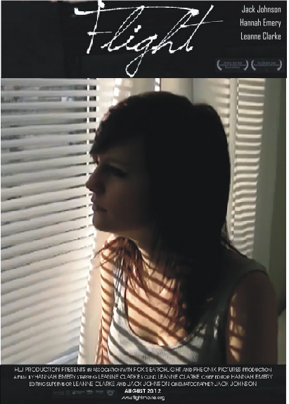
Below is our final film poster.

Chosen Poster Feedback

I wanted to find out what the public thought about our Flight poster and if they thought that any changes should be made so I have sought feedback in a variety of ways.

Twitter
As I have been documenting my progress on the social networking site Twitter I thought it would be appropriate to ask my followers what they thought of the final film poster design. Below is the tweet which I posted and the responses I got.
Public
In order to get a wider range of responses I created a short five question questionnaire to give out to ten members of the public. The five questions I asked and the responses are below.
Question one
Question two
Question three
Question four
people could choose more than one answer
Question five
people could choose more than one answer
Evaluation
From the responses I received there are a few obvious strengths and weaknesses. The strengths being the poster and the visually appealing colours, I personally like the fact the poster has no other strong colours apart from the background as it makes the poster stand out. Another strength mentioned was the emotive feelings the poster portrayed, the interviewees said that the poster connotes feelings of loneliness and confusion which is what we aimed to do as our film is all about isolation and choices. Ten out of ten people said that our film poster was effective and all the responses I received from Twitter were positive although a few suggested minor changes. The main weakness picked up within my research was that many people thought the poster lacked information, when asked to specify this many responded by saying that the poster needed to have the film classification and awards which the film had won on it. As so many people said that this was a weakness of the poster we will add this information onto our final film poster. Another weakness people said was that the grey at the bottom of the poster didn't match with the black background, I too do not like this aspect of the poster and will be changing it when it comes down to creating the final version of our poster.

Film Poster Designs

Today we began to design our final Flight film poster. We each took a different photograph and designed our own poster and then came together at the end of the lesson to pick our favorite out of the three.

My Poster Design

Jack's Poster Design
 

Leanne's Poster Design

Final Decision
We all decided that the poster we are going to use is the one designed by Leanne. We decided this primarily because of the photograph and the colours within it. I like the way our character identity is hidden and I feel that the silhouette of the tree and our character is very visually appealing and will be attractive to audiences. I feel that our chosen poster does portray the drama genre and doesn't give too much away about our film narrative or character, influencing audiences to watch the film. There are still some improvements to make on the poster, such as adding in awards which the film has won to entice viewers into watching and to add in the film age classification to let the audience know what age group the film is aimed at. We also need to change the colour of the bottom of the poster from grey to black to make the poster look more uniformed and professional.